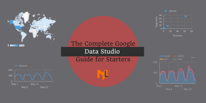
How to use Google Data Studio what is it? This guide takes you on a journey through the world of data visualization, exploring Google Data Studio’s powerful features and functionalities. We’ll uncover the secrets behind connecting to various data sources, crafting compelling visualizations, and designing interactive dashboards. Prepare to transform raw data into actionable insights!
From creating a free account to mastering advanced techniques like calculated fields and data blending, this comprehensive tutorial walks you through the entire process. We’ll also explore real-world use cases across diverse industries, showing how Data Studio can revolutionize your approach to data analysis.
Introduction to Google Data Studio
Google Data Studio is a powerful, user-friendly business intelligence tool offered by Google. It allows users to connect to various data sources, transform them, and visualize them in interactive dashboards. This empowers businesses and individuals to gain insights from their data and make informed decisions. It’s particularly useful for creating insightful reports and dashboards for marketing, sales, and operations teams.Data Studio excels at transforming raw data into actionable insights.
Its core functionalities encompass data connection, visualization, and report generation. It’s a valuable tool for anyone needing to analyze and present data effectively, whether you’re a data analyst, marketer, or simply looking to understand your own personal data.
Data Source Connectivity
Data Studio boasts a broad range of supported data sources, making it adaptable to diverse needs. This flexibility allows users to incorporate data from various platforms and systems into their analyses. This capability is critical for comprehensive data analysis.
- Google Sheets: A simple and widely used spreadsheet application. Users can import data from Google Sheets directly into Data Studio for analysis and visualization.
- Google Analytics: Data Studio seamlessly integrates with Google Analytics, enabling marketers and analysts to visualize website traffic, user behavior, and conversion rates.
- BigQuery: For larger datasets, Data Studio allows connection to BigQuery, a powerful data warehouse service from Google. This provides advanced querying and analysis capabilities.
- Other Data Sources: The platform supports a variety of other data sources, including Salesforce, HubSpot, and many more. This versatility enables users to pull data from various sources to create a holistic view of their business operations.
Creating a Data Studio Account
Setting up a Data Studio account is straightforward.
- Account Creation: Visit the Google Data Studio website. Click on “Sign In” in the top right corner. If you don’t have a Google account, click on “Create account.” Follow the on-screen instructions to create a new account or sign in with an existing one.
- Login: After creating or logging in, you’ll be directed to the Data Studio dashboard. You can now start creating your first data visualization project.
Key Features of Data Studio
Data Studio’s key features empower users to create powerful dashboards and reports.
| Feature | Description | Example |
|---|---|---|
| Data Visualization | Create interactive charts and graphs to effectively represent data. | Line chart showing website traffic over time. |
| Dashboard Creation | Combine multiple visualizations into a single dashboard to present a comprehensive overview. | Dashboard combining website traffic, conversion rates, and user demographics. |
| Customization | Customize the look and feel of your dashboards and reports to match your brand and needs. | Custom color schemes, logos, and branding elements. |
| Collaboration | Share your dashboards and reports with others for collaboration and feedback. | Sharing dashboards with team members for analysis and decision-making. |
Data Connection and Preparation

Connecting to and preparing data is crucial for insightful visualizations in Google Data Studio. This stage often determines the quality and reliability of your reports. Mastering data connection and preparation techniques empowers you to transform raw data into actionable insights.
So, you’re diving into Google Data Studio? It’s essentially a powerful tool for visualizing your data, making sense of trends and insights. Understanding how to use it effectively is key, and that often involves delving into specific attribution models like google data driven attribution. These models help you pinpoint the exact touchpoints in your customer journey that drive conversions.
Ultimately, mastering Data Studio is about turning raw data into actionable strategies.
Connecting to Data Sources
Data Studio supports a wide array of data sources, each with its own connection method. Understanding these methods is essential for seamless data integration. Connecting to Google Sheets, Google Analytics, and BigQuery are common tasks, and each requires a specific approach.
- Google Sheets: Data Studio directly connects to Google Sheets, making it a straightforward option for smaller datasets or when data resides in a readily available spreadsheet. This method is ideal for quick analysis and testing, or when you need to experiment with data transformations within Data Studio itself.
- Google Analytics: Connecting to Google Analytics allows you to analyze website traffic and user behavior. Data Studio provides pre-built connectors to import key metrics and dimensions from your Analytics properties. This is critical for understanding website performance and user engagement.
- BigQuery: BigQuery, Google’s fully managed data warehouse, offers robust querying and analysis capabilities. Connecting to BigQuery enables you to utilize complex queries and perform advanced analytics, including aggregation, filtering, and data manipulation. This is the preferred method for large-scale datasets and complex analyses.
Data Preparation Steps
Preparing data for visualization involves several steps. Data Studio provides tools to clean, transform, and prepare your data before creating visualizations. The steps involved in data preparation will depend on the complexity of the dataset and the desired outcome.
- Data Cleansing: Identifying and handling missing values, duplicates, and inconsistent data formats is crucial for accurate analysis. This process involves techniques like replacing null values, removing duplicates, and standardizing data types.
- Data Transformation: Data transformation is a fundamental aspect of preparing data for Data Studio. This encompasses a range of operations, such as aggregating data (e.g., calculating sums, averages, counts), creating calculated fields, and changing data types. This is essential for extracting meaningful insights from your data.
- Data Validation: Verifying the accuracy and completeness of the data is crucial. This involves checking for errors, inconsistencies, and outliers. Data validation ensures that your visualizations are based on reliable data and avoids misleading conclusions.
Data Transformations Examples
Data transformations are essential for extracting meaningful insights from your data. A common example is calculating the average order value from transaction data.
- Calculating Average Order Value: Suppose you have transaction data with columns for order ID and total amount. To calculate the average order value, you would aggregate the total amounts for each order ID and then divide the sum by the number of orders. This transformation allows you to understand the average revenue generated per order, which is a key metric for e-commerce businesses.
Data Cleansing and Validation Techniques
Data cleansing and validation are crucial for reliable insights. Various techniques can be used to achieve this.
- Handling Missing Values: Missing values can be handled by replacing them with the mean, median, or mode of the column, or by removing rows with missing values. The best approach depends on the nature of the data and the context of the analysis.
- Duplicate Removal: Duplicate data points can skew results. Removing duplicate rows based on specific columns helps to ensure accuracy in analysis.
- Data Type Conversion: Converting data types to appropriate formats is essential. For example, converting text data to numerical format for calculations.
Comparison of Data Sources
The following table summarizes different data sources and their connection methods in Data Studio.
| Data Source | Connection Method | Pros | Cons |
|---|---|---|---|
| Google Sheets | Direct Connection | Simple, accessible | Limited to smaller datasets |
| Google Analytics | Pre-built Connector | Pre-built metrics, easy setup | Limited customization |
| BigQuery | SQL Query | Scalable, powerful querying | Requires SQL knowledge |
Dashboard Design and Organization
Bringing your data to life in Google Data Studio often hinges on how you arrange and present your visualizations. A well-designed dashboard not only communicates insights effectively but also encourages user engagement and understanding. This section will guide you through creating and organizing compelling dashboards that turn raw data into actionable intelligence.
Creating Dashboards from Visualizations
To build a dashboard, you begin by selecting the visualizations you’ve created from your data connections and preparations. Drag and drop these visualizations onto the dashboard canvas. You can resize and reposition them to achieve a balanced and visually appealing layout. Remember, the goal is clarity and ease of comprehension. Using a variety of visualization types, such as charts, tables, and maps, can enhance your narrative and provide a holistic view of the data.
Organizing Visualizations on a Dashboard
Effective dashboard organization relies on clear visual hierarchy and logical grouping of information. Consider grouping related visualizations together. For example, visualizations about sales performance could be clustered together, while those focused on customer demographics might be placed in a separate section. This grouping improves comprehension and provides a more structured overview.
Interactive Dashboard Layouts
Interactive dashboards allow users to explore data dynamically. Filters, for example, can enable users to drill down into specific segments of the data. This dynamic interaction fosters a more in-depth understanding and allows users to focus on areas of interest. You can create interactive filters on visualizations to enable users to quickly isolate specific data subsets.
Google Data Studio is a fantastic tool for visualizing data. It’s essentially a dashboard builder, making it easy to pull insights from your various sources. Understanding how to use it effectively can be a game-changer for your business, especially when you consider how to leverage its power. For example, if you’re trying to understand if feeder sites actually boost your SEO efforts, a thorough analysis using a tool like Data Studio can be incredibly helpful.
Check out this helpful article on feeder sites do they help seo to get more clarity on that topic. Ultimately, learning how to use Google Data Studio will help you to gain a deeper understanding of your data and make better decisions for your business.
Arranging Elements and Adding Filters
Arranging elements on a dashboard requires careful consideration of visual appeal and information flow. Use whitespace effectively to avoid clutter and improve readability. Positioning elements strategically helps the eye navigate the dashboard smoothly. Filters are powerful tools to control what data is displayed on the dashboard. Implementing these effectively enables users to isolate particular data sets for focused analysis.
Good Dashboard Design Principles, How to use google data studio what is it
Good dashboard design adheres to several key principles. Clarity and conciseness are paramount. Use clear labels, intuitive colors, and appropriate fonts to ensure your visualizations are easily understood. Avoid overwhelming the user with excessive information. Focus on presenting only the most important insights and use effective data visualization techniques to communicate these insights effectively.
Dashboard Layout Options
A well-structured dashboard often follows a logical layout. This allows users to quickly grasp the key insights and relationships presented. A variety of structures are available, and the optimal choice depends on the nature of the data and the intended audience.
| Layout Option | Description |
|---|---|
| Row-Column Structure | Visualizations are arranged in rows and columns, creating a grid-like format. This layout is effective for presenting multiple related metrics or comparing data across categories. |
| Hierarchical Structure | This approach utilizes nested visualizations to display data in a hierarchical manner. It is useful for showing data relationships or drill-down capabilities. |
| Tabbed Structure | Organizes different aspects of the data into distinct tabs. This approach allows users to switch between related but independent views. |
Sharing and Collaboration

Sharing your meticulously crafted Google Data Studio dashboards is key to unlocking their true potential. It allows others to gain valuable insights, fostering collaboration and driving informed decision-making. Effective sharing goes beyond simply sending a link; it involves understanding permissions, communication strategies, and collaborative workflows. This section dives deep into the art of sharing and collaborating on your Data Studio creations.
Sharing Dashboard Access
Sharing your dashboard effectively involves carefully considering who should have access and the level of access they require. The steps to share a dashboard are straightforward and efficient. First, locate the “Share” button within the dashboard’s settings. From there, you can specify recipients and tailor their access permissions.
Different Sharing Permissions and Access Levels
Various access levels allow you to control the level of interaction users have with your dashboard. The most common levels include viewer, editor, and commenter. Viewers can only see the dashboard, while editors can modify its content, and commenters can add feedback. This granular control ensures that your dashboard remains secure and usable by the intended audience.
Effective Communication Using Dashboards
Dashboards can serve as powerful communication tools. Use clear and concise visualizations to convey key takeaways. Consider adding context through annotations or brief descriptions to highlight important trends and insights. For instance, a dashboard visualizing sales performance can highlight key regional successes and areas needing attention, enabling stakeholders to readily understand the data and act on it effectively.
Collaborating on a Dashboard
Collaboration is facilitated by assigning specific roles to team members, allowing them to contribute effectively. This could involve editors updating data sources or adding visualizations, or commenters providing feedback on design and content. A collaborative environment fosters innovation and ensures that everyone is on the same page.
Feedback Gathering and Revisions
Regular feedback loops are crucial for refining your dashboards. Establish a process for gathering feedback from stakeholders and incorporating suggestions into subsequent revisions. This could involve designated feedback channels or dedicated review sessions. Implementing feedback directly within Data Studio, such as adding comments, simplifies the process.
Sharing Options and User Permissions
| Sharing Option | User Permission | Description |
|---|---|---|
| Viewer | Read-only | Can view the dashboard but cannot make changes. |
| Editor | Read/Write | Can view and modify the dashboard, including data sources and visualizations. |
| Commenter | Read/Comment | Can view the dashboard and provide feedback through comments. |
Advanced Features and Techniques
Unlocking the full potential of Google Data Studio requires mastering its advanced features. Beyond basic data connections and dashboard creation, advanced techniques empower you to delve deeper into your data, uncover hidden insights, and create more sophisticated visualizations. This section will explore calculated fields, data blending, custom visualizations, and integration with other Google tools, providing practical examples to illustrate their utility.Data Studio’s advanced features aren’t just for experts; they can streamline analysis for anyone needing to extract nuanced information from complex datasets.
Leveraging these features effectively can transform your data analysis workflow, allowing for more precise insights and improved decision-making.
Calculated Fields
Calculated fields allow you to derive new metrics and dimensions from existing data. This powerful capability enables complex calculations and transformations, which can significantly enhance data analysis. By creating custom calculations, you can answer specific questions that aren’t directly available in the original data.
- Creating new metrics: Calculated fields allow you to create entirely new metrics, such as customer lifetime value (CLTV) by combining data on purchase history and customer demographics.
- Advanced aggregations: Beyond simple sums and averages, calculated fields permit complex aggregations, including weighted averages and custom scoring systems.
- Conditional logic: Utilize conditional logic within calculated fields to segment data based on specific criteria, enabling targeted analysis.
Example: A retail company might calculate a “Customer Loyalty Score” by combining purchase frequency, average order value, and return rate.
Figuring out Google Data Studio? It’s basically a tool for visualizing data, perfect for seeing trends and patterns. To make sure your parent surveys are really insightful, crafting them effectively is key. Check out this guide on creating successful parent surveys for some great tips. Once you’ve got those surveys nailed, Data Studio can help you present the results in a compelling and easy-to-understand format, helping you make informed decisions.
Data Blending
Data blending combines data from multiple sources into a single view. This is crucial when dealing with data scattered across various platforms or databases. Blending allows for cross-referencing and comparative analysis, revealing patterns and relationships not visible in isolated datasets.
- Combining data from different sources: Data blending lets you combine sales data from an e-commerce platform with customer data from a CRM system to identify high-value customers and their purchasing behavior.
- Cross-source analysis: Identify correlations between marketing campaigns and sales conversions by blending marketing data with sales data.
- Unified view of data: Create a unified view of your business data across different platforms, eliminating the need for multiple reports and dashboards.
Formula: Data blending essentially links related tables in your data sources based on common fields.
Custom Visualizations
Custom visualizations allow you to create unique visualizations that don’t exist in the standard Data Studio library. This feature empowers you to represent data in a way that best suits your specific needs and enhances clarity and understanding. Custom visualizations go beyond the basic charts, enabling you to tailor visualizations to specific insights.
- Creating interactive graphs: Create interactive charts, graphs, and other visualizations for exploring complex relationships and patterns in your data.
- Tailoring visualizations to specific needs: Design custom visualizations to precisely represent the insights you’re looking for, avoiding generic or overly complex charts.
- Customizing appearance and functionality: Customize colors, fonts, and interactivity to enhance the user experience and clarity of your visualizations.
Example: A non-profit organization could create a custom visualization that displays the geographic distribution of donations over time.
Integration with Other Google Tools
Data Studio seamlessly integrates with other Google tools, allowing for a streamlined workflow and data analysis. This integration significantly enhances data analysis capabilities.
- Connecting with Google Sheets: Import and analyze data directly from Google Sheets, facilitating easy data updates and modifications.
- Integration with Google Ads: Visualize campaign performance metrics directly within Data Studio to gain insights into ad effectiveness and return on investment.
- Connecting with Google Analytics: Track website traffic and user behavior data to understand user journeys and optimize marketing strategies.
Illustrative Use Cases: How To Use Google Data Studio What Is It
Google Data Studio empowers diverse industries by transforming raw data into actionable insights. Its flexible nature allows users to visualize trends, identify patterns, and ultimately, drive better decision-making. From marketing campaign analysis to financial reporting, Data Studio offers a powerful toolkit for any organization seeking to understand its performance and future potential.
Marketing Campaign Performance Analysis
Data Studio provides a dynamic platform to track the success of marketing campaigns across various channels. A marketer can visualize the performance of email campaigns, social media advertisements, and paid search initiatives. Key metrics such as click-through rates, conversion rates, and cost-per-acquisition are easily visualized, offering clear insights into campaign effectiveness. This allows for adjustments to strategies in real-time, optimizing resource allocation and maximizing ROI.
Sales Data Analysis
Analyzing sales data is critical for understanding revenue streams and identifying growth opportunities. Data Studio can create interactive dashboards showcasing sales performance by region, product type, or sales representative. Visualizations like bar charts, line graphs, and geographical maps can highlight key trends, such as seasonal fluctuations in sales or regional performance differences. By identifying these patterns, sales teams can tailor their strategies for enhanced efficiency.
Customer Behavior Analysis
Understanding customer behavior is crucial for targeted marketing and personalized customer experiences. Data Studio dashboards can reveal customer demographics, purchase history, and engagement patterns. For example, a retail company can track website traffic, product views, and abandoned carts to identify areas where the customer journey could be improved. This knowledge allows for more targeted marketing efforts and better customer service strategies.
Customer Acquisition Cost (CAC) and Revenue Generation
Analyzing CAC and revenue generation helps businesses understand the cost of acquiring a new customer and the overall profitability of their operations. Data Studio dashboards can display these metrics side-by-side, allowing for comparisons and trend analysis. Visualizations can reveal how marketing spend correlates with revenue generation. This helps to understand the return on investment of various marketing initiatives.
For instance, a SaaS company can compare the CAC of different acquisition channels to optimize its marketing budget and improve its overall revenue generation.
Website Traffic and User Engagement
Data Studio is ideal for visualizing website traffic and user engagement. Interactive dashboards can display metrics such as unique visitors, page views, bounce rates, and average session duration. These visualizations help identify areas for improvement in website design and user experience. The insights gained can lead to better website navigation, increased user engagement, and higher conversion rates.
Financial Reporting Dashboards
Data Studio empowers businesses to create comprehensive financial reporting dashboards. These dashboards can display key financial metrics like revenue, expenses, profit margins, and cash flow. Visualizations such as charts and graphs help stakeholders quickly grasp the overall financial health of the organization. A company can create separate dashboards for different departments, allowing them to monitor their specific performance metrics against established targets.
This helps in identifying areas needing attention and in ensuring that all aspects of the organization are operating efficiently.
Last Point
In conclusion, Google Data Studio empowers users to transform data into actionable insights. This guide has covered the essential steps from account creation to advanced techniques. By mastering these skills, you’ll be well-equipped to create compelling dashboards and leverage data effectively. Data visualization is key to success, and Data Studio is your tool of choice.


